Necromancer’s Enclave
Third Person RPG
Type of Project: Solo Level Design for personal project
Software Used: Unreal Engine 4, Photoshop, Blueprints
Necromancer’s Enclave:
The Necromancer’s enclave is a personal project I worked on in order to hone my skills in designing in not only the third person perspective, but also in the action-adventure genre. I wanted to try and tackle a visually interesting play-space while also introducing more dynamic and interesting combat encounters. Some of the challenges I faced while designing and building this level included having to tweak the AI to make them work more efficiently with how I intended them to work.
Responsibilities:
Responsible for initial 2D design, whitebox, final layout, combat design, set dressing, lighting, play testing, iteration, and optimization.
Tweaked and implemented varied AI to create a wider breadth of combat encounters.’
Used a variety of art assets to set dress the level and create a visually interesting play space for players to explore.
Made several lighting passes in order to achieve a fantastical and varied environment.
Used lighting and set dressing in order to draw the player’s eyes towards areas of interest in the level.
When first designing this level I wanted to combine the structures of ancients ruin contrasted against a natural world encroaching into the forgotten ruins. I took inspiration from classic fantasy RPGs such as Skyrim, and I also took influence from games like Dark Souls and the Witcher as to how I wanted this dungeon to feel.
I really wanted to use the lighting to create distinct and noticeable pockets within the level to create depth in each room. I wanted each environment to also have their own unique feel, and to highlight the enemies in each environment. I also wanted to use the environment as a means to heighten the gameplay and complexity of each fight. The use of varied vertical levels across each room is an important tool meant to add more options for the player in each fight.
Process
Inspiration
During the process of setting up my layout, I also wanted to get inspiration for the visual look and mood of the Necromancer’s enclave. For the cave sections I really liked the look that Skyrim went for in their caves. I also wanted to make sure the temple parts had felt like they had been abandoned for quiet some time.
I used these images, and a handful more to inspire the look and style I wanted to emulate throughout my level, and try to get the same feeling from each of those pictures. I loved the use of god rays and lighting that these pictures were able to create.
Layout
The layout for the necromancer’s enclave started somewhat straightforward. I took some inspiration from games like Skyrim and Dark Souls with how I wanted this dungeon to work. I wanted to mix styles of both natural and man made temples. The idea was that the hidden necromancy temple had begun to crumble and fall apart, and nature had once again begun to take his course. This allowed me to mix both natural and man-made elements.
Whiteboxing
Starting to Whitebox
I started whiteboxing to make sure the playspace seemed fun and interesting with minimal set dressing and artwork within it. I did place a few art assets down, as I was using asset packs and did not have a dedicated art team, so I wanted to make sure the art assets fit and looked nice within my level.
While doing some playthrough tests I ended moving the hill even more to the right, and lowering its height. I also added height to the big bosses platform, and ended up making the boss smaller overall.
I wanted to make sure the gameplay fit and was fun before I jumped into set dressing and lighting the level. This allowed me to iterate and improve the gameplay quickly without having to worry about having to move art assets and lighting.
Taking Shape
As set dressing began, I tried to fill in the space with the dilapidated ruins and objects from the asset packs I used to see how they fit in the environment. I also made passes at the lighting in order to figure out how it would look fully set dressed. I made several more lighting and set dressing passes to get a fully art level.
Optimization Pass
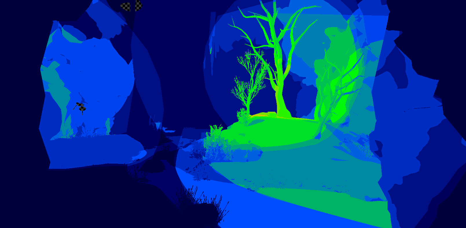
The final step was optimization, as I wanted to make sure the level ran smoothly, and was not chugging along with frames. I made sure to adjust the lightmap density of all the objects that were getting taxing, as well as lowering the lighting complexity by going through and making sure any stationary lights were not overlapping in important places. I also streamlined any player collision, making sure that places the player would never reach or hit were not causing unnecessary collision calculations.


